
Why a small room reads as small
A room does not feel cramped because of its floor area. It feels cramped because of how quickly the eye runs out of information. Walk into a 14 m² bedroom with a long diagonal view to a window and it feels generous. Walk into a 20 m² bedroom where the first thing you meet is the side of a wardrobe and it feels like a corridor with a bed in it.
Everything below follows from three perceptual facts. First, the eye judges size by the longest uninterrupted sightline, not by the square metres on the title deed. Second, contrast creates edges, and every edge the eye registers is another boundary telling it the room stops here. Third, the brain uses known objects for scale — a standard 45 cm seat height, a 200 cm door, a 60 cm kitchen unit — so anything that breaks the expected scale changes how large everything around it seems.
The twelve techniques below are the ones we use on almost every compact apartment in Addis Ababa. None of them require moving a structural wall, and most of them cost less than the wrong sofa.
1. Protect the longest diagonal
Stand in the doorway. Find the longest straight line you can draw through the room to a far corner — usually door to opposite window. That diagonal is your most valuable asset, and it is the first thing most furniture plans destroy.
Keep it clear. Nothing taller than 90 cm should cross it. A console, a low bench, a sideboard: fine. A tall bookcase, a wardrobe door that swings into it, a floor lamp with a wide shade: not fine. In apartments where the entry opens straight into the living area, we often turn the sofa 90 degrees purely to preserve the diagonal, even when it makes the television arrangement slightly less ideal.
Test it in five minutes
Photograph the room from the doorway with your phone held at eye height. Then photograph it again from the same point with the tallest piece of furniture temporarily removed. The difference in the two photographs is the difference every visitor will feel and never be able to explain.
2. Compress the tonal range, do not just paint it white
“Paint it white” is the advice everyone gives and it is only half right. What actually enlarges a room is a narrow tonal range — walls, ceiling, curtains, large furniture and floor all sitting within a few steps of each other in lightness. White walls with a dark chocolate floor and black curtains still read as a box, because each strong contrast draws a hard edge.
In practice we pick a base tone and allow the main surfaces to vary by no more than about 20 per cent in lightness. Warm off-white walls, a light oak floor, curtains a half-step darker than the wall, a sofa in the same family. Then we spend all the contrast we saved on two or three small things: a black-framed mirror, a dark lamp, a rug with a graphic pattern. The room reads as large and still has personality.
Ceilings matter more than people expect. A ceiling painted two or three shades lighter than the walls lifts visually; a ceiling painted the same colour as the walls makes the corner where they meet disappear, which is why colour-drenched small rooms can feel surprisingly generous.
3. Take joinery to the ceiling
A wardrobe that stops 40 cm below the ceiling creates a dust shelf and a horizontal line that cuts the wall in half. Take the same wardrobe to the slab and the wall reads as a single plane, the eye travels up, and you gain a full extra shelf of storage for the suitcases you use twice a year.
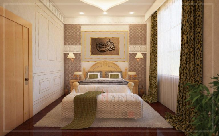
The same logic applies to curtains. Fix the track at ceiling level, not just above the window reveal, and run the fabric to within 1 cm of the floor. The window appears taller, the wall appears taller, and the fabric drop does more work than any amount of paint. In our Mekele hotel suite the curtain track sits in a recessed shadow gap in the ceiling, so the fabric appears to emerge from the plane itself.
4. Choose furniture you can see under and through
Visible floor equals perceived space. A sofa on 15 cm legs shows you a continuous plane running underneath it; a sofa sitting flat on the floor stops the plane dead. The same sofa, the same footprint, a completely different room.
- Prefer raised legs on sofas, beds, armchairs and sideboards in rooms under about 18 m².
- Use open shelving or glass in at least one storage piece so the eye passes through it.
- Wall-hung vanities and WCs in small bathrooms are the single most effective change you can make — the floor runs unbroken to the wall.
- Choose a dining table with a slim frame rather than a solid pedestal if the table sits in a sightline.
5. Use fewer, larger pieces
The instinct in a small room is to buy small furniture. It is almost always wrong. Six small objects create six outlines, six shadow gaps and six competing scales; one large object creates one. A single generous three-seat sofa reads calmer than a two-seat plus two armchairs, even when it occupies more floor.
The same applies to art. One large canvas on the main wall makes a room feel bigger; a gallery wall of eleven small frames makes it feel busier and therefore smaller. If you love the gallery wall, group it tightly so it reads as one rectangle rather than as scattered pieces.
Where you must have several pieces, repeat a dimension: same height for the console and the sofa back, same width for the two cabinets, same frame colour throughout. Repetition reduces the number of edges the eye has to process.
6. Place mirrors where they extend, not where they decorate
A mirror only enlarges a room if it reflects something worth seeing. Hung opposite a blank wall it doubles the blank wall. Hung perpendicular to a window it doubles the daylight and the view, which is what people actually mean when they say mirrors make rooms bigger.
Our rules of thumb:
- Put the mirror on the wall that runs at right angles to the main window, roughly a third of the way along it.
- Make it large — at least 80 cm in the narrow dimension — or the effect is decorative rather than spatial.
- Never place a full mirror directly facing a doorway you use at night; the movement is unsettling.
- In corridors, a mirrored end panel is the cheapest way to double the apparent length. Keep the frame minimal or frameless so the eye is not stopped by the edge.
Mirrored joinery doors are a related trick with one warning: the reflection shows everything opposite, including a cluttered bed. Use them where the opposite wall is calm.
7. Run one floor finish through everything
Changing floor material at every threshold chops a small apartment into a sequence of cells. Running one finish continuously from the entry through the living area, corridor and bedrooms removes those boundaries and can make a 65 m² apartment feel a quarter larger.
If wet areas need a different material, keep the tone and the module close — a porcelain tile that matches the timber in colour and plank width will read as a continuation rather than a break. Lay planks along the longest dimension of the room, and where a corridor meets a room, keep the direction consistent rather than turning the boards at the door.
Skirtings deserve a decision too. A tall painted skirting in the wall colour reads as part of the wall; a dark timber skirting draws a line around the room at ankle height and shrinks it. Shadow-gap skirtings are the most effective of all, though they demand a level of plaster accuracy that not every contractor will deliver without supervision.
8. Light the walls, not just the floor
Nothing makes a room feel smaller at night than a single central pendant. It lights the middle of the floor, leaves the perimeter in shadow, and the walls close in exactly where you need them to recede.
Light the vertical surfaces instead. Wall washers, a discreet LED strip in a curtain pocket, picture lights, or simply two table lamps on opposite sides of the room will push the boundaries outward. Three modest sources beat one bright one every time. We cover the full method in our article on layered lighting design, but for a small room the short version is: at least three light sources, all on dimmers, none of them in the geometric centre of the ceiling.
9. Rethink every door swing
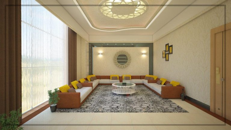
A standard 80 cm door sweeps about 1 m² of floor that you can never furnish. In a 9 m² bedroom that is eleven per cent of the room given to a door. Options, roughly in order of cost:
- Rehang the door to swing against a wall rather than into the room, or change the hinge side so it opens towards the nearest corner.
- Pocket doors where the wall can take them — the best solution for bathrooms and dressing rooms.
- Surface-mounted sliders when the wall cannot be opened up. Cheaper than a pocket, but the door needs a clear wall to slide onto.
- Remove the door entirely on openings that do not need privacy, and treat the opening as an architectural aperture with a proper lining.
10. Make storage disappear into the architecture
Visible storage reads as clutter even when it is tidy. The aim is to make the storage look like a wall. Handleless push-to-open fronts, joinery in the wall colour, and a continuous plane from floor to ceiling turn a wardrobe into a surface. Add a single vertical shadow gap and the wall becomes architecture rather than furniture.
Where you cannot build in, at least align. Match the height of freestanding pieces, run them along one wall rather than distributing them, and keep the tops clear — a clear horizontal line at 90 cm all the way along a wall is enormously calming.
Do not eliminate open display entirely. One open niche or a single shelf gives the eye somewhere to rest and stops the room feeling like a hotel corridor.
11. Borrow space from the next room
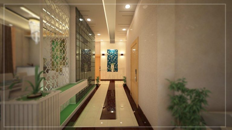
The most dramatic gains come from letting a room see into another. An internal window between a kitchen and a corridor, a glazed panel above a partition, a half-height wall instead of a full one, a ribbed-glass screen that passes light but not detail — each of these extends the sightline past the wall.
In one apartment refurbishment we replaced the solid wall between the kitchen and the entrance hall with a 1.2 m high wall topped with a steel-framed glazed screen. The kitchen lost no storage, the hall gained daylight it never had, and both rooms read as significantly larger. The cost was less than the cabinets.
Planted screens do something similar with a softer effect: they interrupt the view without blocking the light, which keeps the space beyond present in the mind.
12. Edit ruthlessly, then stop
Every object in a small room competes for attention. Twenty-five carefully chosen objects feel designed; forty-five of the same quality feel chaotic. Before buying anything else, remove a third of what is already in the room and live with it for two weeks. Most of our clients never put it back.
But do not over-edit into blankness. A room with nothing in it does not feel large, it feels unfinished, and people compensate by filling it badly within six months. The target is deliberate emptiness in the right places: a clear floor along the main sightline, a clear surface at eye height, and then richness concentrated in one or two moments — a textured rug, a stack of books, a heavy ceramic, a plant with real presence.
The one-page checklist
Print this, walk the room and tick honestly.
| Check | Target |
|---|---|
| Longest diagonal from the door | Unobstructed above 90 cm |
| Tonal spread of major surfaces | Within ±20% lightness |
| Tall joinery | Runs to the ceiling, no gap |
| Curtain track height | At ceiling, fabric to floor |
| Visible floor under furniture | At least three pieces on legs |
| Number of furniture pieces | Fewer and larger, dimensions repeated |
| Mirror position | Perpendicular to the main window |
| Floor finish changes | One material, one direction |
| Light sources | Three or more, on dimmers, walls lit |
| Door swings | None sweeping usable floor |
| Storage | Reads as a wall, tops clear |
| Object count | Reduced by a third, then stopped |
If you get eight of the twelve right, the room will feel noticeably larger. If you get all twelve right, people will assume you moved a wall.
Written by the studio
Samson Berhane is part of the Hanic Interiors design team in Addis Ababa. If this article raised a question about your own project, write to us — we answer every message within one working day.