
What monochromatic actually means
A monochromatic scheme uses one hue — one position on the colour wheel — and varies only its value (lightness), its chroma (saturation) and the texture and sheen of the surfaces carrying it. It is not “a beige room”. Beige rooms fail precisely because they are assembled from four beiges that were never checked against each other, bought at different times, under different light.
Done properly, a monochromatic interior is the most sophisticated thing you can do with colour, because it removes the easiest source of interest and forces every other decision to carry weight. Done carelessly, it is the flattest. There is very little middle ground, which is why so few people attempt it and why it looks so expensive when it works.
Remove the contrast of colour and you must replace it with the contrast of light, texture and form. Nothing is free.Studio rule of thumb
Choosing the hue and committing to it
Choose the hue from something permanent in the room, not from a mood board. The timber of an existing floor, the grain of a stone you already own, the colour of the light coming through the window at the hour the room is most used. In Addis Ababa the afternoon light is strong and slightly warm, which pushes cool greys towards a flat, dirty look; warm-leaning hues hold up far better.
Three families that reliably work for whole interiors:
- Warm neutral (yellow-red family, very low chroma) — sand, oat, putty, clay. Forgiving, flattering to skin, works with timber.
- Green-grey — sage through olive. Reads as calm rather than cold, and looks intentional against planting.
- Deep blue-black — for rooms used mainly at night: studies, dining rooms, media rooms. Dramatic and surprisingly easy, because the eye stops trying to judge distance.
Once chosen, commit. The discipline of a monochromatic scheme is that everything large sits in that family: walls, ceiling, joinery, curtains, upholstery, rug. Accessories may leave the family, but only three or four of them, and only deliberately.
Build a value ladder before you buy anything
This is the single most useful exercise in the whole method. Take your hue and define five steps from lightest to darkest, and assign each step a job. We usually write it as a table and pin it in the studio for the length of the project.
| Step | Value | Where it goes |
|---|---|---|
| V1 | Lightest, near-white | Ceiling, cornice, the plane you want to disappear |
| V2 | Light | Walls — the largest area, the reference for everything else |
| V3 | Mid | Large upholstery, curtains, rug ground |
| V4 | Dark-mid | Joinery, feature wall, dining chairs, heavy textiles |
| V5 | Darkest | Small and deliberate: lamp bases, frames, hardware, one chair |
Two rules keep the ladder honest. First, the largest area takes the widest step — V2 should be at least two steps away from V4, or the room turns to mush. Second, V5 is never more than about ten per cent of the visual field. It is punctuation, not a paragraph.
Texture is the substitute for colour contrast
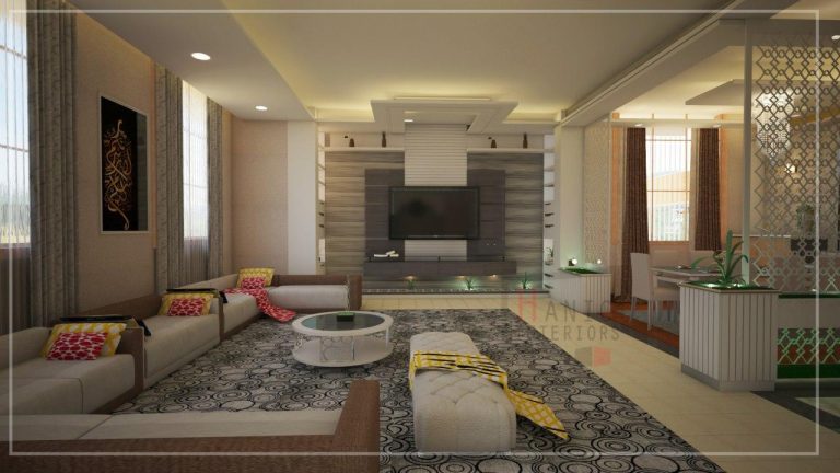
In a scheme where everything is the same hue, texture becomes the primary source of interest, and it does its work through shadow. A bouclé, a heavy linen, a brushed plaster, a fluted timber panel, a hand-glazed tile: each of these produces micro-shadow that reads as a different tone even though the pigment is identical.
Aim for at least five distinct textures in any monochromatic room, and make sure they differ in scale as well as roughness:
- Fine — matt paint, fine linen, honed stone
- Medium — wool rug, brushed timber, rough-cast plaster
- Coarse — bouclé, jute, split-face stone, heavy weave
- Reflective — glass, polished metal, satin lacquer, glazed ceramic
- Deep — velvet, high-pile rug, dense curtain fabric
The reflective category matters more than people expect. One polished or satin element per room gives the light somewhere to land and stops a matt scheme going dead. A single brass handle, a glazed vase, a lacquered tray — small, but structurally necessary.
Sheen: the axis everyone forgets
Two surfaces in exactly the same colour can read as different tones purely because one is matt and the other is satin. This is a free variable and monochromatic schemes should exploit it deliberately.
| Sheen | Reads as | Best used on |
|---|---|---|
| Dead matt (2–5% gloss) | Deeper, softer, velvety | Ceilings, large wall planes, dark rooms |
| Matt / eggshell (10–20%) | Neutral, forgiving | General walls, most joinery |
| Satin (30–40%) | Slightly lighter, crisper | Doors, skirtings, wet areas, cabinetry |
| Gloss (70%+) | Much lighter, reflective, formal | Small accents, one feature element |
A classic and very effective move: paint the walls and the joinery the same colour, walls in matt and joinery in satin. The joinery separates itself with no change of pigment at all, and the room reads as considered rather than lazy.
Test under the light the room actually has
A monochromatic scheme is only as good as its behaviour under the real light of the real room. A low-chroma colour has very little pigment holding it in place, so it shifts dramatically with the light source. The same putty that looks warm and generous at 3000 K can look pink under a 2700 K lamp and grey-green under an overcast sky.
Our testing protocol, which we insist on before any paint is ordered:
- Paint A2-size boards, two coats, not the wall itself — you need to move them around.
- Look at each board against the actual floor sample and the actual fabric, never against a white table.
- View at three times: morning, mid-afternoon, and after dark under the lamps that will really be installed.
- Hold the board vertically against the wall, not flat on a surface. Colour changes with orientation because the light reaching it changes.
- Check the darkest step of the ladder last and in the darkest corner of the room. This is where monochromatic schemes die.
The 2700 K warning
Warm lamps add yellow-red to everything. In a warm-neutral scheme this is pleasant. In a green-grey scheme at 2700 K the greens turn muddy and the whole room looks dusty. If you are committing to a cool hue, specify 3000 K with a CRI above 90 and test before you buy forty fittings.
Pattern, form and the role of the one exception
Pattern in a monochromatic room should be tonal rather than chromatic: a herringbone in two values of the same hue, a self-striped fabric, a fluted panel, a carved plaster. Because the pattern carries no colour contrast, you can use it at a much larger scale than you would dare in a polychromatic room.
Form does heavy lifting too. When colour stops distinguishing objects, silhouette becomes how you tell them apart. A curved sofa against a rectilinear room, a round mirror on a panelled wall, a sculptural chair — these read strongly in a monochromatic setting and are half-invisible in a busy one.
Finally, the exception. Most successful monochromatic rooms contain exactly one element from outside the family: a green plant, a stack of book spines, a single ochre cushion, a piece of art. One is deliberate. Two is a choice. Four is an accident, and the scheme collapses back into ordinary decorating.
Five ways monochromatic schemes fail
- Too many near-identical values. Three shades that are almost the same are worse than one shade. If two samples are hard to tell apart on the board, delete one.
- All matt, all soft. Without a reflective element the room looks like an unfinished plaster mock-up. Add one satin or polished surface per room.
- Ignoring undertone across materials. A greige paint with a green undertone against a greige tile with a pink undertone will fight forever. Undertone must be checked material to material, not colour chip to colour chip.
- No darkest step. Schemes that stop at V4 float and feel unresolved. The room needs something to sit on — a dark lamp base, black frames, a deep chair.
- Treating the ceiling as an afterthought. The ceiling is often the largest single surface in the room. Leaving it builder's white in a warm scheme puts a cold blue plane over everything.
Applying it room by room
Living room
Walls V2, ceiling V1, sofa V3 in a textured weave, rug V3 with a V4 pattern, joinery V4 in satin, and V5 concentrated in lamp bases and picture frames. One plant. One metal finish carried through handles, lighting and frames.
Bedroom
Push everything one step darker than you think. Bedrooms are used at low light levels, and a scheme that looks right at noon will feel washed out at 22:00. Headboard at V4, bedding V2–V3, curtains V3 with a full-height track.
Kitchen
The place where sheen does the most work. Cabinet fronts in V3 matt, the splashback in the same hue but glazed, worktop in V4 honed stone. The kitchen reads as one considered mass rather than as a row of appliances.
Bathroom
Monochromatic bathrooms are the easiest win in the whole house, because the fittings are already white and the materials are naturally varied — honed floor, glossy wall tile, matt paint above, timber vanity. Keep the grout within one step of the tile and half the visual noise disappears.
If you want the same approach applied to your own rooms, our interior design service includes a full value ladder and material board as standard.
Written by the studio
Hailegebriel Girma is part of the Hanic Interiors design team in Addis Ababa. If this article raised a question about your own project, write to us — we answer every message within one working day.