
A branch has to do four things at once
A bank branch is one of the hardest interiors to design well, because four requirements pull in different directions. It must feel open and welcoming so that customers walk in. It must be secure, which means controlled access, protected cash routes and clear surveillance. It must be efficient, moving a queue through a limited number of tellers without anyone feeling processed. And it must be recognisably the brand, in a way that survives a laminate refurbishment in seven years.
This article collects what we learned designing the competition scheme for the Hijra Bank S.C. first branch in Addis Ababa — a project where the whole proposal had to be explained to a board that does not read architectural drawings.
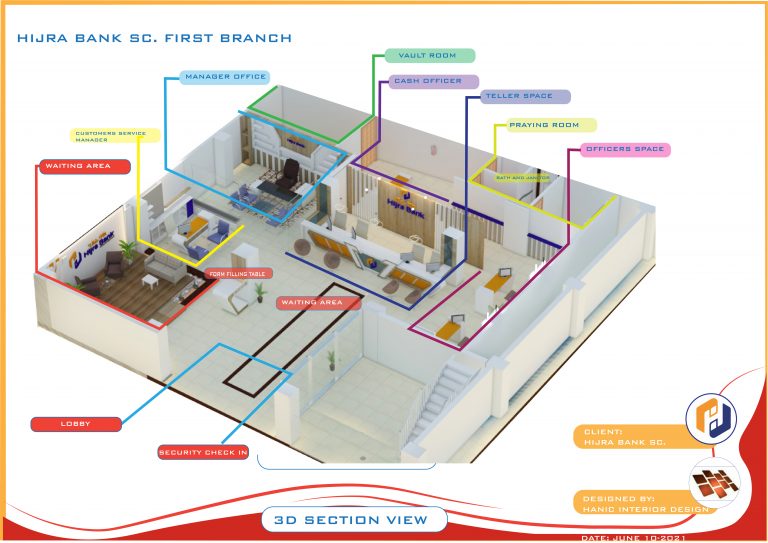
Zoning: four bands from the door
Every branch, from 90 m² to 900 m², resolves into the same four zones. Get the sequence right and the rest of the design becomes straightforward.
1. Public — arrival
Entrance lobby, ATM lobby, information point, queue management. This zone is unstaffed for part of the day, so it must be securable separately from the rest of the branch. It is also the only zone most customers ever experience in a self-service visit, which is why spending the whole budget behind the counter is a mistake.
2. Public — transaction
Teller counters, waiting seating, writing desk, digital signage. The heart of the branch and the space that determines how the bank is judged.
3. Semi-private — advisory
Customer service desks, account opening, loan discussion, branch manager office. Requires visual openness for trust and acoustic separation for confidentiality — a combination that drives most of the detailing.
4. Secure — back of house
Vault, cash handling, staff room, server, records. Accessed only through controlled doors, never visible from the public zone, and with a cash route that never crosses the customer path.
The rule that never bends
The cash route and the customer route must not cross at any point, at any time of day. If the plan requires a teller to carry a cash box across the public hall, the plan is wrong — regardless of how good it looks.
Queue design: the numbers behind the feeling
Waiting is the main thing customers do in a branch, so the queue is the main thing you are designing. A simple model gets you surprisingly close.
- Arrival rate — customers per hour at peak. Ask for the bank's own data; it always exists, and it is usually three to four times the daily average during the Friday afternoon peak.
- Service time — average minutes per transaction, typically 3–5 minutes for a cash transaction and 15–25 for account opening.
- Tellers needed ≈ (arrival rate × service time) ÷ 60, then add one. The extra position absorbs variance and is the difference between a calm hall and a bad reputation.
- Queue space — allow 1.0 m² per waiting person standing, 1.8 m² seated. A branch expecting 20 people at peak needs 20 m² of waiting area that does not block circulation.
A single serpentine queue serving all tellers is measurably fairer and feels shorter than separate queues per position, even when the total wait is identical — people tolerate a long queue that visibly moves far better than a short one that does not. Where a numbered ticket system is used, the display must be visible from every seat, or customers stand up to check it and the seating stops working.
Give the waiting area something to look at. A blank wall opposite the seats makes five minutes feel like fifteen. Planting, a textured wall, or a well-designed signage panel measurably reduces perceived wait.
The teller counter: ergonomics and security
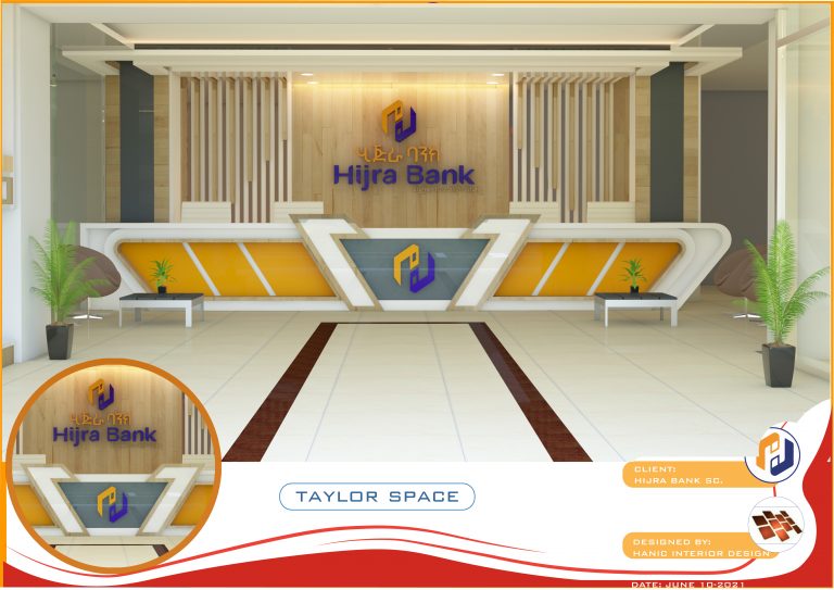
The counter is the most detailed piece of joinery in the branch and the one most often bought from a catalogue. It should not be.
| Dimension | Value | Why |
|---|---|---|
| Customer-side worktop height | 1050–1100 mm | Comfortable standing writing height |
| Teller-side worktop height | 720–750 mm | Seated working height |
| Counter depth | 600–700 mm | Separation without shouting |
| Position width | 1400–1600 mm | Room for customer plus companion |
| Accessible position | 760–800 mm worktop, 700 mm knee clearance | At least one per branch, mandatory |
| Transaction tray | Recessed, 300 × 200 mm | Passing documents and cash without reaching |
Screens are a security decision with a large design consequence. Full-height glazing reads as a fortress and hurts acoustics; a low screen with a transaction opening reads as open but offers less protection. Increasingly branches use a laminated glass screen to about 1.6 m with an open transaction zone, plus a secure back-of-house cash route so the screen is not carrying the whole security burden.
Whatever you choose, resolve the speech transmission problem. A screen without a speech panel or an intercom creates a branch where every transaction is conducted at a shout, which destroys the confidentiality you built the screen to protect.
Security that does not feel like security
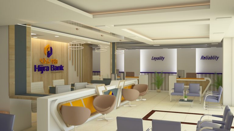
Security in a branch works best when it is architectural rather than applied. A well-planned branch needs fewer visible devices because the geometry is doing the work.
- Sightlines from the manager's desk to the entrance and the teller line give passive supervision with no equipment at all.
- A single controlled door between public and staff zones is better than three that are propped open by lunchtime.
- Air-lock entry at the main door manages both security and, usefully, dust and noise.
- Camera positions must be coordinated with the ceiling design before the gypsum goes up, or they end up surface-mounted in the middle of a feature panel.
- Lighting to camera specification — minimum 200 lux at face height at the entrance and the counter, with CRI above 80, or the footage is useless at the moment it matters.
- The vault door is a fixed point in the plan. Its swing, its frame and the structural requirement around it are set before anything else; design the room around the door, never the reverse.
Acoustics and confidentiality
Banking conversations are private by law and by expectation, and a hard-surfaced hall makes that impossible. Three measures cover almost every branch:
- Absorb at the ceiling. A perforated gypsum or acoustic raft over the transaction and waiting zones takes reverberation time from an uncomfortable 1.6 s down towards 0.8 s. This single move does most of the work.
- Separate the advisory rooms properly. Partitions must go to the slab, not to the suspended ceiling — a partition stopping at the ceiling grid provides almost no privacy. Specify an acoustic seal at the door and avoid undercut ventilation gaps.
- Introduce masking. A low level of broadband background sound, or simply locating the queue far enough from the counter, prevents the next customer overhearing the current one. Two metres of separation between the served customer and the head of the queue is the practical minimum.
Brand: material, not vinyl
A branded interior is not an interior with a logo in it. The brand should be legible with every logo removed — through material, colour, proportion and the quality of a detail.
In the Hijra Bank scheme the brand is carried by a warm timber and cream palette, a repeated arch motif in the joinery, and a single accent colour used consistently and sparingly on the teller fascia, the signage and the seating. The logo appears twice in the entire banking hall. Everything else is architecture.
Practical rules we now apply to every branded interior:
- Use the brand colour on one plane per room, not on every surface. Saturated corporate colours are exhausting at scale.
- Carry the brand through a material, not a print. A specific timber, a particular stone, a distinctive metal finish — these survive a refurbishment and a photocopier-quality reprint does not.
- Design the signage family with the interior, at the same time, at the same scale. Signage added afterwards always looks added afterwards.
- Detail the fascia to be re-skinned. Brands change every decade. The joinery should allow the front panel to be replaced without rebuilding the counter.
The manager's office and the advisory desks
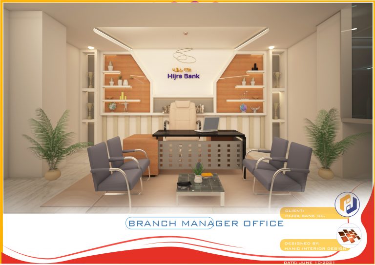
The branch manager's office is a negotiation between supervision and authority. Too enclosed and the manager loses sight of the hall; too open and customers will not discuss a loan application. Our solution in most branches is a glazed office with an internal blind, positioned so the desk faces the entrance, with the glazing to the hall running from 900 mm to ceiling so seated conversation is screened while standing supervision is not.
Advisory desks in the open hall need three things that are routinely forgotten: a visitor chair the customer can reach without squeezing past, a screen orientation the customer can see (shared screens build trust; hidden screens destroy it), and cable management, because a desk with a visible tangle of cables tells the customer exactly how carefully this bank handles detail.
Delivering the scheme to a non-technical board
The competition was won on communication as much as on design. A board of directors approving a branch rollout is not reading a 1:50 plan, and a beautiful interior render tells them nothing about whether the queue works.
What worked for us:
- One annotated 3D section per floor. Cut the building open, label every zone in plain language, and colour-code public, semi-private and secure. A director can understand the entire operational logic in fifteen seconds.
- A customer journey sequence. Four images: arriving, queueing, transacting, leaving. This answers “what will it feel like” far better than a plan.
- A staff journey sequence. Same treatment for the cash route and the staff entrance — this is where operations directors ask their hardest questions.
- One page of numbers. Teller positions, peak capacity, waiting seats, area schedule. It signals that the aesthetics rest on arithmetic.
- A replicability statement. For a branch network, show how the scheme adapts to a smaller and a larger unit. Boards are buying a system, not one room.
If you are planning a branch, a retail unit or any customer-facing interior, our 3D visualisation and space planning services are built around exactly this kind of presentation. Tell us about the project and we will show you the full Hijra Bank set.
Written by the studio
Mesganaw Abateneh is part of the Hanic Interiors design team in Addis Ababa. If this article raised a question about your own project, write to us — we answer every message within one working day.