
Specification is where interiors are won or lost
Two apartments can be built from the same drawings and the same budget and look nothing alike after eighteen months. The difference is almost never the design. It is the specification: which paint, which board behind the tile, which edge on the worktop, which grout, which silicone.
A finish fails in one of three ways — it wears, it moves, or it stains — and every material in this article is assessed against those three. What follows is the working knowledge our studio applies to every material board, written for the conditions we actually build in.
Gypsum, plaster and paint
Nothing shows a bad substrate like a matt wall in raking light. Before choosing a colour, agree the surface.
Levels of finish
Ask for the finish level in writing. A Level 3 finish is fine behind a tall wardrobe; a wall lit by a grazing cove light needs Level 5 — skim-coated across the full surface — or every joint and screw will read as a shadow. The cost difference between Level 4 and Level 5 is real but small compared with repainting a wall twice.
Sheen and durability
- Matt (2–10%) — beautiful, hides substrate imperfection, marks easily. Best for ceilings and low-traffic walls.
- Eggshell / matt emulsion (10–20%) — the workhorse for most walls. Washable versions are worth the premium in corridors and children's rooms.
- Satin (30–40%) — joinery, doors, skirtings, and walls in kitchens. Shows substrate flaws, so only over a good surface.
- Gloss (70%+) — rare in contemporary interiors except as a deliberate feature. Demands a perfect substrate.
Junctions
Where gypsum meets a different material, the junction will crack unless it is designed. Use a shadow gap or a proprietary bead, never a feathered edge of filler. The same applies at the wall-to-ceiling junction on any partition that can move: a 6–10 mm shadow gap costs almost nothing at build stage and eliminates a crack that will otherwise reappear every dry season.
Timber and veneer
Timber is the material clients ask for and the one most likely to disappoint if it is specified loosely. “Oak” is not a specification.
| Product | Stability | Best for | Watch out for |
|---|---|---|---|
| Solid hardwood | Moves with humidity | Worktops, stair treads, furniture | Needs expansion allowance and regular oiling |
| Engineered board | Good | Flooring | Wear layer thickness — under 3 mm cannot be sanded |
| Veneered MDF | Excellent | Wall panels, joinery doors | Veneer matching and sequencing must be specified |
| Melamine / laminate | Excellent | Carcasses, budget fronts | Edge banding quality is the whole game |
For veneer, specify the cut (crown, quarter, rift), the match (book, slip, random) and whether panels are sequence-matched across an elevation. A book-matched run across four doors looks deliberate; four random panels look like a mistake, and they cost the same.
Finish matters as much as species. A hard-wax oil can be repaired locally and ages well; a two-pack lacquer is tougher but a scratch means refinishing the whole panel. In hospitality we use lacquer; in homes we almost always use oil, because the owner can fix it themselves.
Stone, porcelain and terrazzo
Natural stone
Marble stains, and no sealer changes that — it slows the stain, it does not prevent it. Specify marble where the patina is acceptable (a bathroom vanity, a fireplace) and not where it is not (a kitchen worktop in a household that cooks with turmeric and lemon). Granite and quartzite are far more forgiving. Always approve the actual slabs, not a sample chip: veining varies enormously within a batch.
Porcelain
Technically superior for floors in almost every respect: non-porous, dimensionally stable, available in large formats. Two numbers matter — the PEI rating for surface wear (PEI 4 for residential floors, PEI 5 for commercial) and the slip rating (R10 minimum for internal wet areas, R11 for external and shower floors). Rectified edges allow 2–3 mm grout joints; non-rectified need 4–5 mm or the lines will wander.
Terrazzo
In-situ terrazzo is beautiful, seamless and expensive, and it requires a contractor who has done it before. Precast terrazzo tiles get most of the look for a third of the risk. Either way, agree the aggregate size and the base colour from a poured sample, not a photograph.
Grout is a design decision
Grout colour changes the appearance of a tiled surface more than the tile does. Grout within one shade of the tile makes the surface read as a single plane; contrasting grout turns it into a grid. Specify epoxy grout in showers and behind cooktops — cement grout in those positions will discolour within a year, no matter how well it is sealed.
Textiles, upholstery and rugs
Textile is where an interior gets its comfort and where a budget quietly disappears. Three technical numbers should appear on every fabric specification:
- Martindale rub count — above 20,000 for domestic upholstery, above 40,000 for commercial seating. Below 15,000 is decorative only.
- Light fastness — 5 or above for anything within reach of direct sun. Ethiopian daylight is fierce; a 3-rated fabric on a sunny window seat will fade visibly in one dry season.
- Composition — natural fibres feel better and wear worse. A wool-synthetic blend is usually the right compromise for a family sofa.
For rugs, wool outperforms everything else in a living room: it resists crushing, hides soil, and is repairable. Specify the pile height (8–12 mm for under dining chairs, 15–20 mm for lounge comfort) and always specify an underlay — it doubles the life of the rug and stops it moving.
Curtains: allow 2 to 2.5 times fullness. Anything less looks mean and no fabric quality rescues it. Line everything, and interline in bedrooms where blackout matters.
Metals, hardware and the things you touch
Hardware is the part of an interior that people physically touch every day, and it is the first thing to feel cheap. Spend disproportionately here.
- Pick one metal finish per project and carry it through handles, taps, lighting, sockets and frames. Two finishes is a decision that must be argued for; three is an accident.
- Brushed and satin finishes hide fingerprints; polished chrome and gloss black show every one. In kitchens and bathrooms this decides how the room looks day to day, not how it looks in photographs.
- Unlacquered brass will patina — that is the point, but the client must be told, in writing, or it becomes a complaint.
- PVD coatings are far more durable than electroplating for coloured metals such as brushed brass and gunmetal, and worth the premium on anything handled.
- Hinges and runners are invisible and decisive. Soft-close, full-extension runners with a 25 kg rating transform how joinery feels. This is the least glamorous line in the BOQ and the one we never let a client cut.
Building a material board people read the same way
A material board exists so that the client, the contractor and the designer all imagine the same room. That means real samples at meaningful size, arranged in the proportion they will occupy.
- Use real samples. Printed swatches lie about colour and say nothing about texture, which is half the information.
- Size them proportionally. If the floor is 60 per cent of the visible surface, the floor sample should dominate the board. A tiny floor chip next to a large fabric swatch misleads everyone.
- Orient them as built. Floor samples flat, wall samples vertical. Colour changes with orientation because the light reaching the surface changes.
- Photograph the board under real light at morning and evening, and put both photographs in the issued document.
- Label everything with a specification code that matches the schedule: supplier, product, colour, finish, size, and where it goes.
- Keep a duplicate board on site. The one that stays in the studio is for decisions; the one on site is what the foreman compares deliveries against.
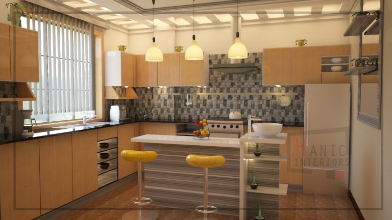
Where to spend and where to save
| Spend on | Because | Save on |
|---|---|---|
| Hinges, runners, handles | Touched daily, cheap ones fail fast | Carcass material — melamine is fine inside |
| Floor finish | Largest surface, hardest to replace | Skirting profile — simple is better anyway |
| Taps and shower valves | Replacement means opening a wall | Basin and WC ceramic — mid-range is durable |
| Sofa frame and foam | Determines comfort and lifespan | Sofa fabric — recoverable later |
| Lighting fittings and drivers | Flicker and poor CRI ruin everything | Decorative pendants — swap them any time |
| Worktop | Heat, water, knives, daily use | Splashback — a good tile is inexpensive |
The general rule: spend on what is built in, permanent or mechanical, and save on what can be changed in an afternoon. A cheap hinge behind an expensive door is a bad interior; an expensive hinge behind a modest door is a good one.
Every one of our projects is issued with a full finish schedule and a duplicate site board — see the interior design and fit-out services.
Written by the studio
Samson Berhane is part of the Hanic Interiors design team in Addis Ababa. If this article raised a question about your own project, write to us — we answer every message within one working day.